
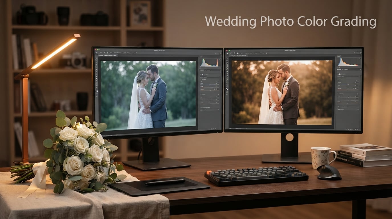
If you have ever scrolled through a wedding album and felt an instant emotional pull, chances are the photographer spent serious time on color grading. Wedding photo color grading is the artistic process of shaping color and tone across your images so the entire day tells a single visual story.
Over the past seven years, I have edited more than 200 wedding albums, and I can tell you this: the couples who love their photos longest are not always the ones with the most dramatic edits. They are the ones whose photos feel cohesive from the bridal suite to the last dance. That cohesion comes from intentional color grading.
In this guide, I will walk you through what wedding photo color grading really is, how it differs from color correction, the techniques our team uses every week, the most popular styles couples ask for, and the software that gets the job done. By the end, you will have a clear workflow you can start applying to your own wedding photos today.
Whether you are a professional photographer looking to tighten your editing workflow or a couple trying to understand what goes into a polished wedding gallery, this guide breaks down every concept in plain language. No jargon, no skipped steps.
Table of Contents
What Is Wedding Photo Color Grading and Why Does It Matter
Wedding photo color grading is the post-production step where photographers adjust the hues, saturation, luminance, and tonal contrast of an image to create a specific mood, style, or emotional atmosphere. It goes beyond basic color correction by adding creative intent to the final look.
Color correction is the technical foundation. It fixes white balance, normalizes exposure, and removes color casts so the image looks true to life. Color grading is what happens after correction. It is where you push warmth into golden hour portraits, drop shadows into teal for a cinematic feel, or lift blacks for a soft film look.
Why does this matter for weddings? A wedding day moves through wildly different lighting environments. You might have soft window light in the bridal suite, harsh midday sun during the ceremony, warm tungsten in the reception, and blue hour portraits at sunset. Without grading, those moments feel disjointed. With grading, the entire album feels like one continuous story.
Clients may not know the technical term, but they always notice the result. When the album flows visually from the first look to the grand exit, the day feels more complete in their memory. That is the power of color grading done right.
Color Correction vs Color Grading: The Key Difference
The fastest way to understand the difference is to think of correction as fixing and grading as styling. Correction brings the image back to neutral reality. Grading pushes it toward a creative vision.
Here is a simple breakdown:
Color correction aims for accurate skin tones, proper white balance, even exposure, and clean whites.
Color grading aims for mood, style, and emotional tone. It is where you choose warm or cool, light or moody, film or modern.
Professional wedding photographers always run these as two separate steps. If you try to grade before correcting, you end up chasing problems that should have been solved first.
One helpful analogy: color correction is like tuning an instrument so every note plays in pitch. Color grading is like choosing the song, the tempo, and the emotional arc of the performance. You need both, in that order, for a wedding album that sounds and feels right from beginning to end.
Essential Color Grading Techniques for Wedding Photos
These are the techniques our team uses on every single wedding, in this order. I have seen beginners skip steps and spend hours trying to fix problems that proper sequencing would have prevented in minutes.
Step 1: Start With White Balance and Exposure
Before you touch any color tools, fix the temperature, tint, and exposure. Use the eyedropper on a neutral gray card if you shot one, or eyeball the whites and skin tones. The goal at this stage is accuracy, not style. If your whites are slightly yellow or your skin tones look green, the rest of your grade will look off no matter what you do.
Shoot RAW whenever possible. RAW files give you far more latitude for white balance and exposure adjustments than JPEGs, which bake in corrections that are hard to undo cleanly.
Step 2: Correct Skin Tones First
Skin tones are the most important element in any wedding photo. Use the HSL panel (Hue, Saturation, Luminance) to target the orange and red channels. Adjust hue to land the skin on a natural axis, then nudge saturation down only if needed. This step alone prevents the dreaded orange-skin look that plagues over-styled wedding albums.
Different skin tones respond differently to the same adjustments. Check your grade across subjects with varying complexions so nobody looks washed out or oversaturated. Natural skin tone preservation is the number one priority clients mention when reviewing a gallery.
Step 3: Adjust the HSL Panel for the Overall Look
The HSL panel is your main creative tool. Pull saturation out of colors you want to recede (often greens and blues in wedding settings) and push saturation into accent colors like the bouquet, bridesmaids’ dresses, or floral arrangements. Shifting the green hue slightly toward yellow often gives a more flattering outdoor look without losing realism.
Step 4: Use the Tone Curve for Contrast and Mood
The tone curve controls contrast and color channels independently. A gentle S-curve adds depth. Lifting the blacks slightly creates a soft, faded film look. Dropping the blacks deeper creates a punchy, modern feel. You can also adjust the red, green, and blue curves individually to push warm highlights or cool shadows.
Small moves on the tone curve go a long way. Nudge two to five points at a time and check the result at full size before committing. Heavy curve adjustments look great on screen but can fall apart in print.
Step 5: Apply the Color Grading Panel for Split Tones
The Color Grading panel (formerly Split Toning) lets you add different hues to your shadows, midtones, and highlights. A classic cinematic look uses teal shadows with warm orange highlights. A light and airy look uses pale yellow highlights with very subtle cool shadows. Keep the saturation low (between 5 and 15) for natural-looking results.
Step 6: Use Selective Masks for Targeted Adjustments
Radial and linear gradients let you darken skies, brighten faces, or warm up a background without affecting the whole frame. Mask the dress to keep whites pure while you lift the background exposure. Mask the couple to add a subtle glow while keeping the surroundings grounded.
Modern Lightroom also offers AI-powered subject and sky masking, which can save significant time on outdoor wedding shots. Use these tools to isolate the couple quickly, then apply targeted exposure and warmth only where it matters most.
Step 7: Apply the Grade Consistently Across the Album
This is where most photographers fail. They perfect one photo, then cannot reproduce the look across 800 more. Sync your settings in Lightroom using the Match Total Exposures and Color Grading sync options. Then check at least 20 random frames from different parts of the day to confirm consistency.
Popular Wedding Photo Color Grading Styles
Every couple has a different taste, and most of the time they will not know the technical name for what they want. Here are the styles we get asked for most often, with the visual characteristics that define each one.
Light and Airy
Light and airy is the most-requested style for outdoor and spring weddings. It features bright exposure, soft contrast, lifted shadows, and pale warm highlights. Whites look creamy rather than pure. Greens tend toward yellow-green rather than emerald. Skin tones stay soft and luminous. This style feels romantic, optimistic, and timeless.
To achieve it, lift the exposure slightly, pull contrast down, lift the black point on the tone curve, and add a faint warm tint to the highlights. Keep saturation modest throughout. Overdoing any single adjustment kills the softness that defines this look.
Dark and Moody
Dark and moody is the opposite end of the spectrum. It features deep shadows, rich contrast, and desaturated colors. Blacks are true black, not lifted. Colors feel jewel-toned. This style works beautifully for fall and winter weddings, indoor receptions, and couples who want a cinematic, editorial feel.
Film Look
The film look mimics the characteristics of analog film stocks like Portra 400 or Fuji 400H. It features soft contrast, gentle color shifts, fine grain, and slightly muted saturation. Highlights roll off softly instead of clipping. Skin tones have a creamy, slightly warm cast. This style is popular with couples who want nostalgia and authenticity.
Faded or Matte
Faded grading lifts the blacks so they are no longer pure black, which gives a slightly hazy, vintage feel. Saturation is reduced overall. Shadows lean toward a soft brown or teal depending on the look. This style pairs well with rustic venues, barn weddings, and golden hour portraits.
Warm and Earthy
Warm and earthy grading pushes amber, terracotta, and olive tones throughout the image. Shadows lean warm rather than cool. It works beautifully for desert weddings, autumn celebrations, and couples drawn to boho aesthetics. Skin tones stay golden without crossing into orange.
Cinematic Teal and Orange
This is the blockbuster look. Shadows and backgrounds shift toward teal while skin tones stay warm and orange. The contrast between cool and warm creates visual depth and pulls attention to the couple. It is most effective for dramatic portraits and sunset sessions.
To build the teal and orange look, push teal into the shadow channel of the Color Grading panel and warm orange into the highlights. Then refine skin tones with the HSL panel so they stay natural against the cooler background. Done well, this style feels filmic without looking artificial.
Achieving Consistency Across a Wedding Album
Consistency is harder than any single edit. Our team handles 500 to 1,200 photos per wedding, shot across at least four different lighting environments. Here is the workflow that keeps everything cohesive.
Break the Album Into Same-Scene Chunks
Do not edit photos one at a time across the entire day. Group them by scene: bridal preparation, ceremony, family portraits, couple portraits, reception, dancing. Edit and sync one strong representative image from each scene, then apply those settings across the rest of the batch.
This approach mirrors what experienced wedding photographers on photography forums recommend again and again. Breaking edits into same-scene chunks saves hours and produces more predictable results than trying to process the entire gallery in one pass.
Calibrate Your Monitor First
You cannot achieve consistency if your monitor shows colors differently from your client’s. Use a hardware calibrator like a Datacolor SpyderX or X-Rite i1Display at least once a month. This single step prevents most of the “why does this look different on my screen” frustration.
Build Custom Presets, Not Just One-Click Solutions
Generic presets look generic on your work. Build your own base presets for each style you offer, then customize them per wedding. This gives you speed without losing the personal touch that makes your work yours.
Purchased presets can be a useful starting point, but relying on them without adjustment is one of the fastest ways to end up with inconsistent results. The lighting at every venue is different, and a preset built for golden hour portraits will not translate cleanly to a dimly lit reception hall.
Best Software for Wedding Photo Color Grading
You do not need every program on the market. You need the right tool for each part of the workflow. Here is how our team divides the work.
Adobe Lightroom Classic
Lightroom is the workhorse for most wedding photographers. The HSL panel, tone curve, color grading panel, and masking tools cover about 90 percent of what you need. Catalog management, sync settings, and batch export are unmatched. If you are starting out, learn Lightroom deeply before adding anything else.
Capture One Pro
Capture One is preferred by photographers who want the highest possible image quality. Its RAW processing engine is widely considered the best in the industry, especially for skin tones. The learning curve is steeper, and it costs more, but the color tools and tethering features make it worth considering for studio and high-end wedding work.
Adobe Photoshop
Photoshop handles the remaining 10 percent of work. Detailed retouching, complex composites, frequency separation for skin, and dodging and burning all happen here. Most wedding photographers use Photoshop as a finishing tool on top of Lightroom rather than their primary editor.
Recommended Workflow
For a typical wedding, our team works in Lightroom for culling, color correction, grading, and export. We open images in Photoshop only for heavy retouching, sky replacements, or composites. This combination keeps the workflow fast while giving you access to every tool you need.
Many photographers debate Lightroom versus Capture One for wedding photography. The honest answer is that both are capable of producing professional results. Lightroom wins on speed, catalog management, and ecosystem integration. Capture One wins on RAW quality and color control. Pick the one that fits your workflow, not the one with the loudest fan base.
Seasonal Adjustments for Color Grading
Different seasons throw different light at your camera, and your color grading should adapt accordingly. A grade that looks stunning on a summer beach wedding will fight you during a December candlelit ceremony.
Spring and Summer Weddings
Spring and summer bring abundant natural light, lush greens, and long golden hours. Light and airy grading works naturally here because the light already leans soft and warm. Watch for harsh midday shadows during outdoor ceremonies and use a radial gradient to lift shadows on faces.
Fall Weddings
Fall weddings come with rich foliage, overcast skies, and warm ambient tones. Warm and earthy grading complements the natural color palette. Pull green saturation down slightly so leaves do not compete with skin tones, and push a touch of warmth into the highlights to echo the season.
Winter Weddings
Winter weddings often mean low light, cool color temperatures, and indoor venues. Dark and moody grading suits these conditions well. Boost exposure carefully to avoid noise, warm up the white balance to counteract blue indoor lighting, and protect shadow detail in dark suits and dresses.
Common Color Grading Mistakes to Avoid
I have made every mistake on this list at some point. Here are the issues that show up most often in wedding albums and how to fix them.
Orange skin tones: Pull saturation out of the orange channel in the HSL panel and check skin tone balance across multiple frames.
Over-saturation: Wedding colors look great in person but rarely need a saturation boost. Try lowering saturation before you raise it.
Inconsistent white balance: One warm photo next to a cool photo breaks the album. Sync your white balance across the entire day.
Crushed shadows: Drag the shadow slider up slightly before adding contrast. Wedding photos need to show detail in dark suits and dresses.
One-click presets applied to everything: A preset is a starting point, not a final edit. Adjust each batch for the specific lighting of the scene.
Over-processing detail shots: Rings, florals, and table settings already have strong color. Grade them with restraint so they match the overall album tone.
Color Psychology for Wedding Photos
Color carries emotion, and the choices you make during grading will shape how couples feel when they look back at their photos. Warm tones (yellow, orange, soft pink) read as romantic, nostalgic, and joyful. Cool tones (blue, teal, soft green) read as calm, elegant, and timeless. Neutral tones feel modern and refined.
When you are grading, ask yourself what feeling the couple wanted for their day and grade toward that emotion. A couple who planned a lively summer celebration will respond to warmth and brightness. A couple who chose an intimate winter ceremony may prefer a quieter, more cinematic palette.
This is not about following a formula. It is about matching the visual tone of the album to the emotional tone of the day. The best wedding photo color grading feels invisible because it simply amplifies what was already there.
FAQs
What is color grading in wedding photography?
Wedding photo color grading is the post-production process of adjusting hues, saturation, luminance, and tonal contrast to create a specific mood or style. It happens after color correction and is what gives a wedding album its cohesive look and emotional tone.
What is the difference between color correction and color grading?
Color correction fixes technical issues like white balance, exposure, and color casts so the image looks accurate. Color grading adds creative style on top of correction by adjusting tones to achieve a specific mood, such as light and airy, cinematic, or film look.
What are the best color grading techniques for wedding photos?
The most effective wedding color grading techniques include starting with white balance and exposure correction, normalizing skin tones through the HSL panel, applying a tone curve for contrast, using the Color Grading panel for split tones, masking with radial gradients, and syncing settings across same-scene batches for consistency.
What are the most popular wedding photo color grading styles?
The most popular wedding photo color grading styles are light and airy, dark and moody, film look, faded or matte, warm and earthy, and cinematic teal and orange. Each style suits different venues, seasons, and couple preferences.
How do wedding photographers achieve consistent color grading across an album?
Photographers achieve consistency by breaking the wedding into same-scene chunks, editing one strong reference image per scene, syncing settings across the batch, calibrating their monitor, and avoiding heavy reliance on single-click presets that do not adapt to changing lighting.
How do wedding photographers use Lightroom for color grading?
In Lightroom, wedding photographers use the Basic panel for exposure and white balance, the HSL panel for skin and color tuning, the Tone Curve for contrast, the Color Grading panel for split tones, and masking tools for selective adjustments. Sync settings across each batch for consistency.
Final Thoughts on Wedding Photo Color Grading
Wedding photo color grading is where the technical craft of photography meets the storytelling art of the wedding day. Start with clean color correction, build a grading workflow you can repeat, choose a style that matches the couple’s vision, and stay consistent across the album. The photographers who master this process are the ones whose work couples remember ten years later.
Practice on your next wedding by picking one style, editing a full scene from start to finish, and reviewing the result with fresh eyes the next morning. Consistency, not complexity, is what makes wedding photo color grading truly shine.