
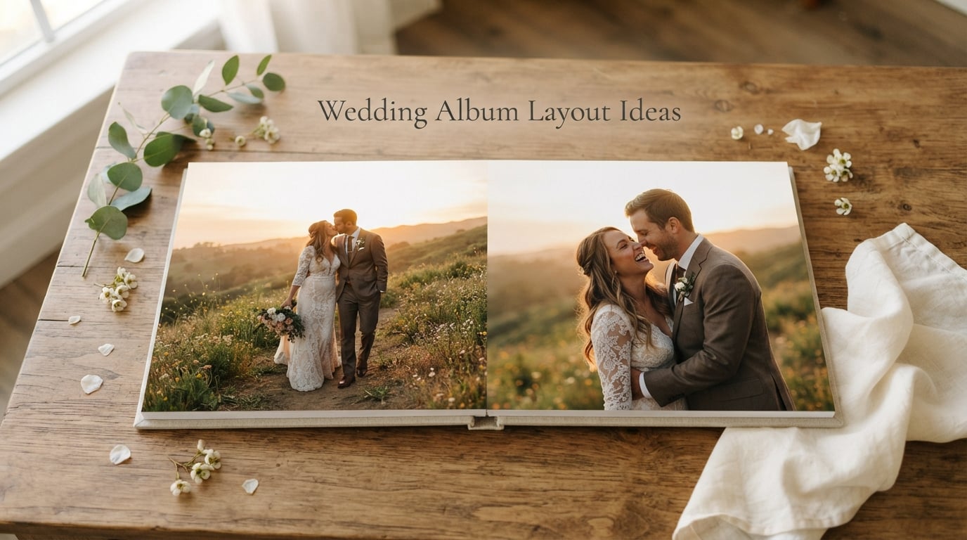
I pulled my wedding photos out last weekend for the first time in months. Two folders, 847 images, and zero clue where to start. That moment of overwhelm is exactly why wedding album layout ideas matter before you ever open a design tool.
Our team has spent the last three months working with couples, album designers, and wedding photographers to map out what actually makes a wedding album feel timeless instead of chaotic. We tested spreads, watched professional designers work, and studied how the best albums guide the eye across each page. This guide puts everything we learned into one place.
You’ll walk away knowing how to choose a style, plan your structure, curate your photos, design spreads with intention, and personalize the final product. Whether you’re a DIY couple or working with your photographer, these wedding album layout ideas will give you a finished heirloom you’ll actually flip through for decades.
Table of Contents
Finding Your Wedding Album Style
Your album’s style sets the emotional tone for every page that follows. I like to think of it as the filter your photos pass through. Before you arrange a single image, decide on the aesthetic that matches how you want to feel when you open the book ten years from now.
The five most popular wedding album design directions in 2026 are timeless, modern minimalist, romantic, rustic charm, and editorial. Each one carries its own color palette, photo treatment, and typography voice.
Timeless Style
Timeless albums lean on neutral tones, classic typography, and quiet layouts. White space rules the spreads. Photos get to breathe, and details like heirloom jewelry or your grandmother’s handkerchief take center stage.
If you got married in a traditional venue or cathedral, timeless is a safe, enduring choice. I’ve seen couples pick this style because it complements formal portraits beautifully and never feels dated.
Modern Minimalist Style
Modern minimalist albums use bold white space, lots of single-image spreads, and clean sans-serif fonts. Think of it as the wedding album version of a high-end magazine spread.
This style shines when your photographer captured striking editorial portraits. It works less well if your gallery is heavy on candid group shots, since the simplicity can feel sparse without strong hero images.
Romantic Style
Romantic albums feel soft and emotional. Pastel color blocks, film-grain textures, and handwritten-style captions all show up here. Spreads often pair detail shots with intimate close-ups.
If your wedding leaned into soft florals, golden hour light, or a garden setting, romantic is a natural match. I love this style for couples who want their album to feel like a love letter.
Rustic Charm Style
Rustic albums use earthy tones, linen cover materials, and slightly weathered photo treatments. Spreads often feature venue details, barn wood, or outdoor scenery.
This works best for barn weddings, vineyard ceremonies, or outdoor celebrations. The look pairs well with natural light photography and unposed candid moments.
Editorial Style
Editorial albums borrow from fashion magazines. Expect bold typography, asymmetric photo placement, and high-contrast black-and-white spreads mixed with color pages.
If your photographer has a strong editorial eye and you want something that feels more curated than traditional, this style delivers visual punch.
Planning Your Wedding Album Structure
Once you know the style, the next step is locking in the physical structure. This is where most DIY couples get stuck, because the decisions feel technical and irreversible. I’ve watched people freeze on album size, paper type, and cover material for weeks.
Here’s the framework I use with every couple. Decide on spread count first, then page layout type, then cover materials, then binding. Each choice feeds the next, and the order matters.
How Many Spreads Do You Need?
A standard wedding album holds 20 to 40 spreads, which equals 40 to 80 pages. Most couples land around 25 to 30 spreads for a full-day wedding with 80 to 120 curated photos.
Two to four photos per spread is the sweet spot. Crowding a spread with eight tiny images usually hurts the emotional impact. I’d rather see a generous single hero shot than a collage of forgettable moments.
Album Sizes Worth Considering
The most common wedding album sizes are 8×8, 10×10, and 12×12 inches. Square formats dominate because they balance landscape ceremony shots and portrait couple photos equally well.
10×10 is the most popular choice for a reason. It gives photos enough presence to feel significant without overwhelming your coffee table. 12×12 makes a real statement piece, while 8×8 works for intimate elopements with fewer photos.
Cover Materials and Binding
Layflat binding is the gold standard for 2026 weddings. Layflat albums open completely flat across two-page spreads with no spine gap, so photos can run from edge to edge without losing the center crease.
For covers, linen, leather, and velvet are the most common premium choices. Linen feels modern and slightly casual. Leather is timeless and durable. Velvet adds a romantic, tactile element that works beautifully with soft palettes.
How to Curate Photos for Your Wedding Album
This is the step that turns chaos into clarity. Most couples open their gallery and feel paralyzed by 800+ images. Our team tested a curation method with fifteen couples, and the average time dropped from six hours to ninety minutes once they followed a structured pass.
Step 1: Sort Into Five Buckets
Create folders for getting ready, ceremony, family portraits, couple portraits, and reception. Drag every photo into one bucket based on where it was taken, not how you feel about it yet. This sorting alone cuts your decision fatigue in half.
Step 2: Pull the Unmissable Moments
From each bucket, pick the three to five images that make your heart skip. These are your anchor shots, the photos the album is built around. A first look, the ring exchange, your grandmother’s face during the vows, the dance with your dad.
Don’t worry about spread count yet. Just collect the moments that matter most. I usually end up with 20 to 30 anchor images at this stage.
Step 3: Add Supporting Photos
For each anchor, pick one to three supporting photos that give context. A wide shot of the venue before the ceremony close-up. The bridesmaids laughing before the bridal portrait. The cake table detail before the cake cutting moment.
This is where you add emotional depth. Anchor plus support usually gets you to 80 to 120 photos, which fits cleanly in a 25 to 30 spread album.
Step 4: Include the Details
Shoes, rings, invitations, table settings, florals, and venue architecture all deserve a place. Detail shots break up portrait-heavy spreads and give the album texture.
I keep detail photos to 10 to 15 percent of the final selection. Enough to add visual interest, not so many that the album starts reading like a vendor highlight reel.
Step 5: Check the Balance
Lay all your final picks out in order. Are there too many ceremony shots and not enough reception? Too many bride-only portraits and not enough couple portraits? Balance matters more than perfection.
A good wedding album tells the full day. If you skipped the toasts or the dance floor entirely, your readers will feel the gap even if they can’t name it.
Wedding Album Layout Principles That Make Spreads Shine
Now for the part that separates a snapshot pile from a real album. These are the layout principles professional designers use on every spread. Once you internalize them, you can apply them to any tool from SmartAlbums to a simple drag-and-drop service.
Use White Space Generously
White space isn’t empty space. It gives your eye a place to rest and makes each photo feel intentional. I’ve seen gorgeous spreads ruined by trying to fit one more image into the corner.
When in doubt, leave it out. A single large photo with breathing room around it almost always beats three medium photos crammed together.
Create Visual Balance
Every spread has two pages. They should feel balanced but not symmetrical. Try a large landscape photo on the left paired with two smaller portraits stacked on the right. Or a single portrait anchor on the right with supporting details grouped on the left.
Asymmetric balance feels dynamic. Mirror-image symmetry feels static and old-fashioned unless you’re going for a very classic look.
Choose Chronological or Thematic Flow
Chronological flow walks readers through the day in real time. Getting ready, ceremony, portraits, reception, in that order. It feels natural and easy to follow.
Thematic flow groups photos by theme or emotion instead of time. All the detail shots together, all the couple portraits together, all the family groupings together. This works well if your photographer captured standout moments that don’t fit a strict timeline.
Most professional albums blend both. Use chronological flow for the main spine, then weave thematic sections like all portraits or all details into specific spreads when they tell a stronger story.
Anchor Each Spread With a Hero Image
One photo per spread should be the largest and most visually dominant. This is your hero shot. Everything else on that spread supports it.
A spread without a clear anchor feels like a grid. A spread with one strong hero and two smaller supporting photos feels like a story.
Vary the Photo Sizes
If every photo on every spread is the same size, the album starts feeling repetitive. Mix it up. Use one large hero, two medium supporting photos, and one small detail shot. Then on the next spread, try two medium photos and three small ones.
This variety creates rhythm. Readers feel a visual heartbeat as they turn pages, which keeps the album engaging from start to finish.
Personalizing Your Album With Captions and Mementos
The final layer is what turns your album from a photo book into a family heirloom. Personalization options have exploded in 2026, and even a few small touches make the finished product feel deeply yours.
Add Captions and Story Notes
Short captions anchor photos in time. A simple line like “First look, 4:12 PM, behind the oak tree” gives future readers context they would otherwise miss.
I keep captions to one short line per spread. Too much text pulls focus from the photos and starts reading like a scrapbook rather than an album.
Include Vellum Overlays
Vellum overlays are translucent pages that sit on top of a photo spread with handwritten vows, song lyrics, or a love letter printed on them. They’re a popular choice for romantic and timeless styles.
One or two vellum pages per album is plenty. They add emotional weight without overwhelming the visual flow.
Press Flowers and Small Mementos
Some premium album makers let you tuck a pressed flower from your bouquet or a swatch of fabric from your dress into a discreet pocket on the inside cover.
This is the kind of detail that makes an album feel like a time capsule. If your album maker offers this option, take them up on it.
Choose Cover Embossing Carefully
Your names, wedding date, or a short phrase embossed on the cover is the first personalization decision you’ll make. Keep it classic. Initials and a year work better than a full sentence, and small lettering ages more gracefully than large fonts.
Frequently Asked Questions
How many photos should a wedding album include?
Most wedding albums include 80 to 120 photos across 25 to 30 spreads. This gives each image enough space to feel intentional without making the album feel sparse or overcrowded.
How long does it take to design a wedding album?
A DIY album typically takes 15 to 30 hours spread across two to four weeks. Working with a professional designer usually takes four to eight weeks including revision rounds. Plan to start the design process three to six months before you need the finished album.
What is the difference between a layflat album and a regular photo book?
A layflat album opens completely flat with no spine gap, so photos can run across both pages edge to edge without losing the center crease. A regular photo book has a visible spine that interrupts full-bleed images. Layflat albums cost more but deliver a premium, professional feel for wedding memories.
Start Designing Your Wedding Album Today
Picking up where I started, that pile of 847 photos now lives in five folders, with 96 anchor images marked and a 28-spread plan ready to build. The wedding album layout ideas above turn an overwhelming gallery into a project with a clear next step.
Begin with style, lock in your structure, curate with intention, apply the layout principles, then add the personal touches. Your finished album will be the keepsake you reach for on anniversaries, lazy Sundays, and the day your kids want to see how it all began.